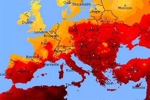
Those of you who have been conscious for any part of the summer will be aware that this is the hottest summer ‘ever’. I do not have any data to refute these claims. So let’s assume that this is true as far as the data can be interpreted and a conclusion can be drawn from the interpreted data.
I am not going to try and put this in a historical context – the only thing we know less about than the current climate is the historical climate. But we can put the temperature data in a more rational context.
I have seen the climate data quoted in the celsius scale and the fahrenheit scale. These are arbitrary scales based in part on the physical properties of water. They are useful everyday measures of temperature but they are not an absolute measure of temperature.
There is an absolute measure of temperature. Temperature is an expression of the thermal energy contained in a material. The scale of temperature measurement that starts at zero thermal energy is Kelvin. If we use the Kelvin system for expression of temperature we are using an absolute scale of thermal energy and it is contextually meaningful in an absolute sense.
Lets start crunching some data – this is the global temperature data that is publicly available https://datahub.io/core/global-temp
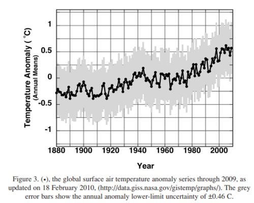
When you plot the ‘temperature anomaly’ in celsius against year you get this data

That has a large upwards gradient. The data available presents the temperature anomaly in the range of about -0.4 to 1.0 degC. First of all we should recenter this about the mean anomaly for the period to remove the ‘hot bias’ in the data presentation.
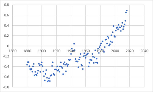
OK so now we are showing the data around the mean value of the data set from -0.7 to +0.7 degC – and we have the same upwards gradient.
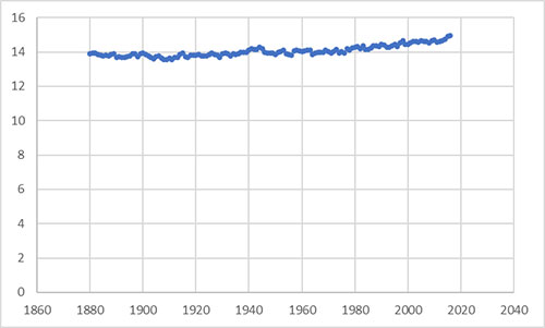
From this reference https://earthobservatory.nasa.gov/world-of-change/global-temperatures the average global temperature for his time period is 14 degC. We can convert the temperature anomaly into a global average temperature. Showing this on a celsius scale starting at the freezing point of water we can reduce the gradient of the data.
But that is not really meaningful. What we are concerned with is the increase in the thermal energy being retained by the atmosphere. Using the Kelvin scale where 0 degrees Celsius equals 273 degrees kelvin the gradient of the graph now looks like this:
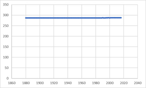
How much has the thermal energy content of the atmosphere increased? If we take the mean of the temperature in kelvin over the time period shown the percentage change in the heat content (min to max) of the atmosphere is around 0.5%
This is a change, but it is not very large.
How accurately can we measure the total thermal energy contained by the atmosphere? What is the confidence in the data?
There is a paper here:
https://www.science-climat-energie.be/wp-content/uploads/2019/07/Frank_uncertainty_global_avg.pdf
That shows that the total measured/interpreted change in temperature is roughly the same as the uncertainty in the measurement of the data.
Is a possible total increase of the thermal energy content of the atmosphere of 0.5% a cause for concern?
Maybe.
How accurately can we measure this metric anyway?
Shrill media driven rhetoric and exciting new verbiage from the United Nations declaring we have moved from “Global Warming” to “Global Boiling” is not convincing. Especially as we should all recall a few years ago when it had not warned for some time the climate situation was contemporaneously branded as ‘climate change’ and ‘climate disruption’. As we now might have a discernible warming trend we are back to an updated version of the original language.
When the language around the thing is more important than the thing itself, you are listening to marketing. Not science.
I think it is more concerning that the total heat energy of the atmosphere may have increased by 0.5% than ‘it is a bit warmer in Spain this summer’.
What do you think? What is the integrity of the current measuring methods and the historical data we use for comparison? How much are we fooling ourselves that we understand anything at all about what is going on?
Hi,
The gradient is the same whether you plot the temperature in Celsius or Kelvin. Reliability of the data is also same as in any other discipline. Technology and technics are getting better with time. If we don’t trust the data here, why should we trust any data? There are always dishonest scientist who seek rather glory and attention, like discovery of the room temperature superconductivity. But there are thousands other who check the data. As long as peer review is working, we the laymen can trust the data.
Regards,
Sergej
Trust in data is based on the ability to verify the data – see if you can find the unadjusted raw global temperature data and if you can find it in a form that does not take weeks of work to interpret. If a team of engineers only got paid if their strain gages read higher and higher strains, and the higher the strains the more money you got paid, there would be a bias towards higher interpretation of gage readings and a strong desire to make the actual gage data more difficult to find and interpret.
“As long as peer review is working” How much of the headline grabbing data is actually directly quoting peer reviewed science? I did reference peer reviewed data in my article.
The numerical gradient is the same but the conclusions you would draw from the results are completely different depending on the scale you use. Total thermal energy is the relevant scale.